Capita
Increasing Army applications with a new secure platform

The British Army recruits 365 days a year. To support this, their always-on marketing function needs to funnel target Gen Z audiences to their dedicated recruitment website. But, with little conversion happening, it was letting them down.
Battling against the current UK employment market and a general lack of knowledge about the British Army, the website simply didn’t reflect the modern, diverse, future-facing ambitions of the institution.
That’s where we came in. Tasked with moving the British Army website forward by 10 years – in 12 weeks – we were asked to deliver a 10% increase in new registrations. But, what’s better than meeting those targets? Absolutely smashing them: delivering a 97% increase in conversions, when compared year-on-year.
Here's how we did it
Our deep user research unveiled a disrupted user journey that was sub-optimal on mobile devices The Army’s audience was struggling to find the content they needed and were discouraged by the outdated look and feel of the site– another huge barrier to their digitally-native, mobile-first audience of 16–24 year-olds.
The redesigned website needed to:
- Inform the audience about opportunities available in the Army, no matter their ability
- Educate on what to expect from a life in the Army
- Convert knowledge into action, turning curiosity and excitement into registration
- Prepare the user for the realities of application and assessment
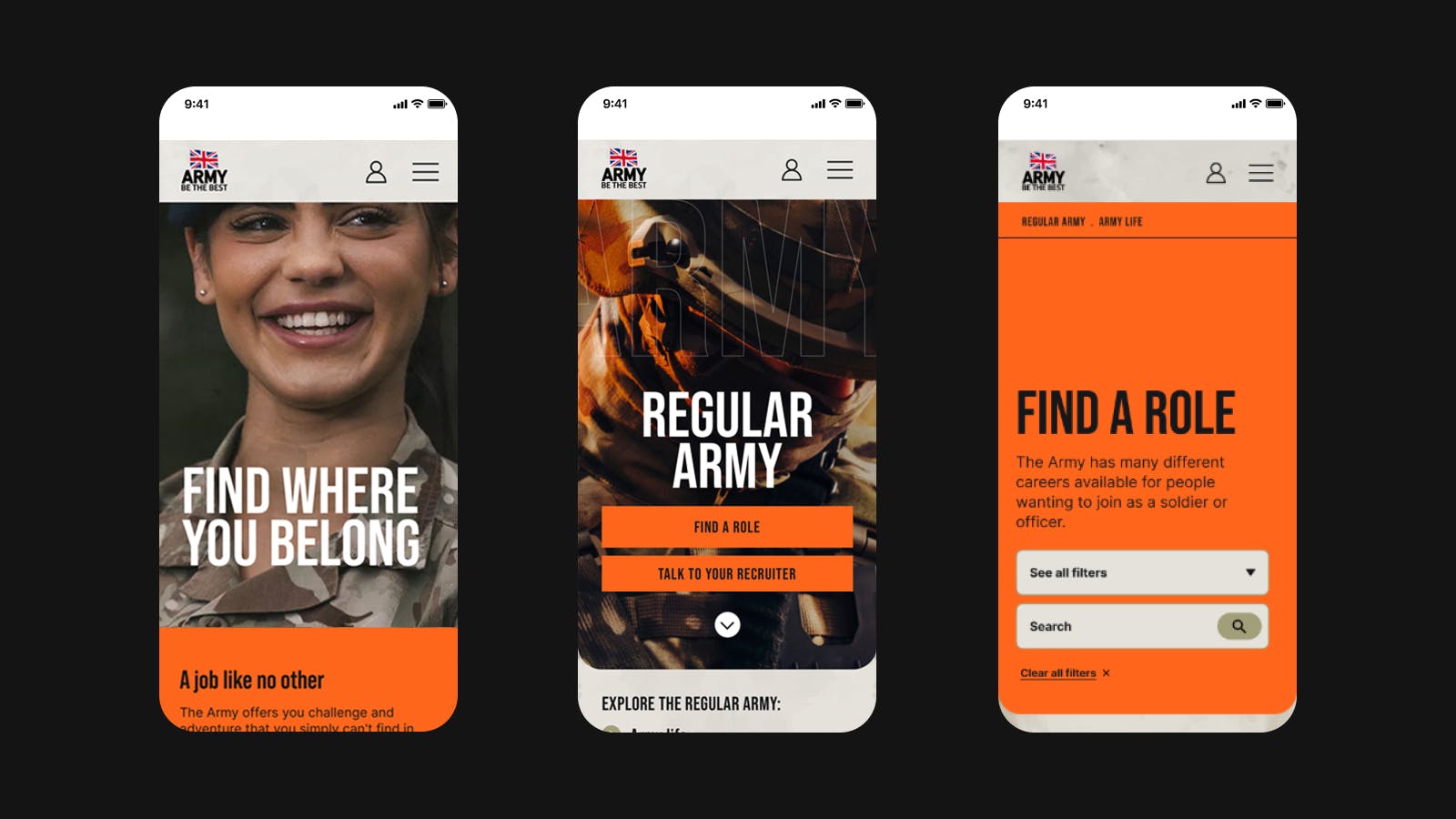
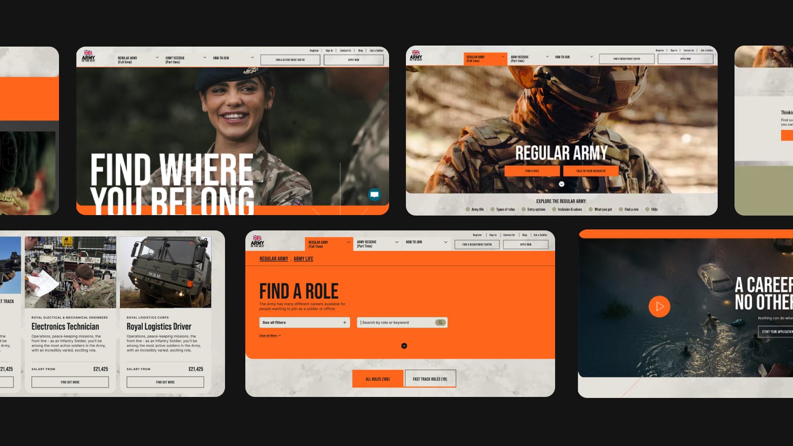
Mapping user journeys, we recommended a structure that split up content by audience. This allowed for unique and targeted experiences that enabled the site to meet the needs of three distinct user groups – regular, reserve or specialist.

The user journey was designed to funnel these potential applicants through their perfect content journey. Digestible information needed to be presented in a hierarchy that felt personalised, compelling, and stood up against rival employers vying for the attention of similar candidates. Users needed to understand the wide variety of roles available in the Army and, crucially, find the role that was right for them.
To earn this level of engagement, the Army’s recruitment needed to look and feel completely renewed. It needed to move from brooding and formal to energetic and approachable, inspiring intrigue and action.
Employing scroll-encouraging motion principles and gritty imagery, we assembled a new creative direction that spoke to the target audience. With an empathetic focus on the needs and concerns of potential recruits, our design choices were all about capturing the human experience: the camaraderie, the grit, and the gratification. Ultimately, moving away from traditional military imagery.

To underpin the new experience, our Technical Architects proposed an application and infrastructure architecture that enabled rapid development of the MVP, and flexibility to pivot in the future, if needed.
Based on the Next.js framework, the application architecture leverages its static and incremental generation technology – providing a fast, performant website that is easily deployable. Not to mention, security was of paramount importance, so the website was deployed on MODCloud: utilising Azure App Services and Azure App Gateway to serve the website securely.
We were tasked with hitting a modest 10% increase in registrations - but - we smashed through The British Army’s recruitment targets.
The new website has delivered a staggering increase of 97.7% in terms of new registrations year-on-year.
Not only that, we generated:
- An increase of 19.8% in overall visits
- An increase of 53.1% in page views
- An increase of 27.8% in terms of average page views per visit
The above data indicates that users are visiting, registering, and returning to the Army Job Site and staying longer.