12 Years of Collaboration: A Digital Takeoff with Bristol Airport
Our journey with Bristol Airport began 12 years ago. Not the type of journey you’d traditionally expect to have at an airport, but instead a journey of a digital kind. We’ve just designed and delivered their new website, 12 years after we got our hands on it for the first time.
So here’s the story of Bristol Airport, a Bristol agency and over a decade of digital progress.
The beginning
It was lovely to be working with the Bristol Airport team again. Not just because I’m from Bristol and therefore it felt important to me to look after their brand, but because there was a renewed appetite from them to create a beautiful new website. We wanted to capture this enthusiasm and get them involved with the creative process from the start.
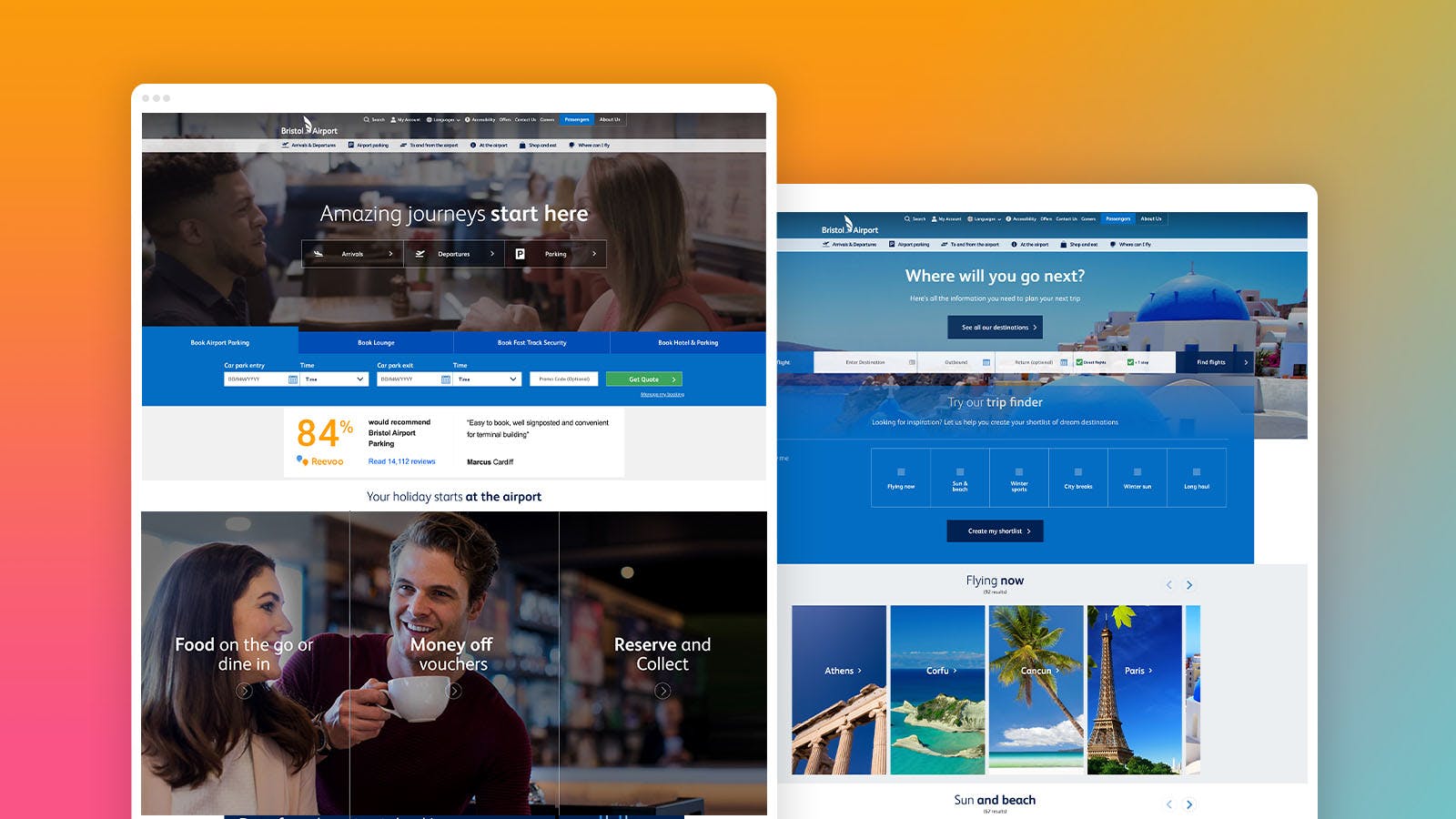
Don’t get me wrong, our work for Bristol Airport was cutting edge in 2012, but since then, things have (forgive me) *taken off* digitally and their existing site needed to transform, work harder and offer a rejuvenated customer experience that represented their status as a major international airport. When I first worked on the site, I was creating carousels for the home page as well as other small improvements to some of the key feature areas. Over the years, we’d continued making other improvements across the website but there were limitations with the way the previous site had been built, and it was hampering how far we could go with the new one.

Our approach 10 years ago was very different to what it is now – but that’s what ten years of experience and digital progress will do. After dusting off the original designs, which were initially started in Photoshop (!) it was clear to us that it needed a complete overhaul, from the tarmac up.
The brief
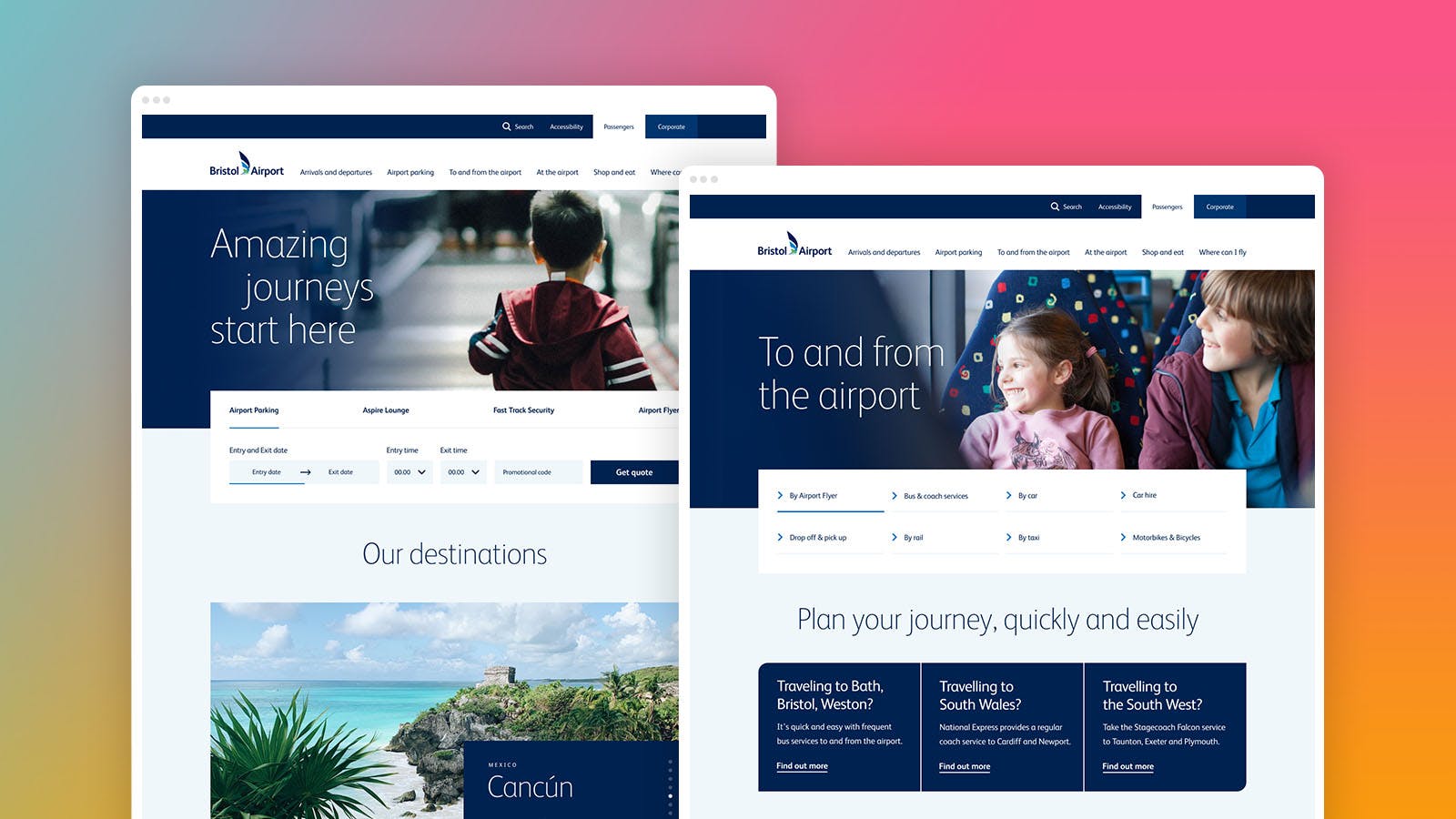
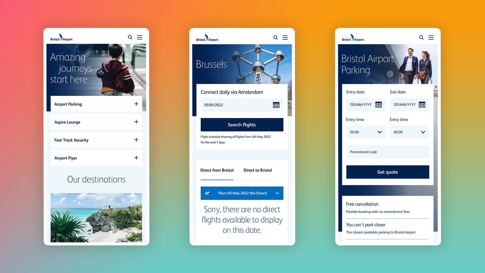
The initial brief was to transform and scale the customer experience of the website, through a redesign of the user interface but also the addition of functionality such as the trip finder tool, destination inspiration, real time information on arrivals and departures, booking widgets, as well as an overhauled parking and hospitality experience. An ever-increasing percentage of passengers now access and book through their mobile phone, so we needed to optimise the site for mobile too.
The creative solution
Initially we concentrated on refreshing the look of some key components around the site. These modules allowed us to flex our creativity, developing visual treatments for interactive masthead and other featured components. Bristol Airport were impressed with how we were evolving their brand online which then led them to ask us to take over the whole website.
The website had to work hard on so many levels. It’s an e-commerce booking portal for their car parking, it hosts the Aspire Lounge, and Fast Track Security amongst a whole other host of features and information. It’s a one-stop information hub for all the airport facilities as well as a reliable source of up to date information on arrivals and departures. It had to be helpful, operate seamlessly, be easy to navigate and also demonstrate the strong association that Bristol Airport has with the South West – something to be proud of.
We kicked off with a series of workshops where we collaboratively defined and developed their vision. We looked at their existing website, competitor websites, branding mood boards and interaction design. We took a deep dive into some key templates, allowing them to rethink components and take control of the ideal user experience. Certain things that seemed important back in the day were now seen as superfluous to Bristol Airport and their user’s needs and some components were simply in the wrong order on the page. Together we were able to make these edits using a super low fidelity approach which really worked for our client. The essential insight that we took from these early workshops formed the bedrock of what was to become a whole Bristol Airport 'design system'. A design system forms an essential base for all the elements of a site, and also speeds up the design phase. They produce a more consistent user experience through the development of a common visual language, encompassing things like interface templates and correct typographic scales. Essentially design systems help to bridge the gap between design and development.

A design system was something Bristol Airport had not previously considered. The original website was designed and built around a few key pages created in Adobe Photoshop. This time we started to get the client to look at their site from an atomic level. The main advantage of working this way is that the components were going to be reusable across the site.

The website reflects not only twelve years of digital advancement, but also the strength of a local, strategic partnership that will continue to serve the South West for years to come. And for me as a designer, a very satisfying opportunity to experience a design evolution come back full circle. It’s always a rewarding moment to see a project go live, a cause for celebration, so… where shall we fly to?
The new Bristol Airport website was built on Umbraco and went live in the middle of November.
"It’s been a real collaborative project, working with Great State who have been our digital agency for over 10 years. They have transformed the design and user experience, creating an enjoyable experience for our customers and a robust platform from which we’ll continue to optimise and develop over the coming years. We’re delighted with the end result.”
Isabelle Whiteman - Head of Marketing, Bristol Airport
You can get to the website from here.